
Athleta Product Branding
Product Branding Guide & Monogram
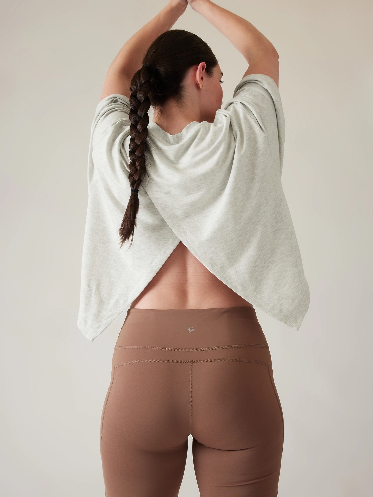
When Athleta approached us, they entrusted us with a vital task: their current product range lacked consistent branding, affecting styles across 200+ fabric bases. Our mission was to honor their brand and nurture their valued customer connections while addressing this significant challenge.
Understanding the importance of authentic brand usage, we created a comprehensive style guide. This guide acts as a compass, outlining unique branding elements and standards, that we fondly call Athleta's "handwriting."
Following this guide ensures Athleta's identity flows seamlessly through every interaction, aligning values and creating a lasting impression.
At Studio Marylou, partnering with Athleta sparks our creativity. Together, we've crafted a visual language that binds the brand, strengthens customer bonds, and propels Athleta toward a future of success.
Our commitment to preserving Athleta's brand and our dedication to harmonious design reassure us that Athleta's message will resonate, inspiring people to embrace vibrant lifestyles.
Services
Brand Strategy & Identity

A glimpse of behind the methodology that brought Athleta's product branding vision to life. We sampled from 200+ fabrics and techniques with meticulous precision, setting the stage for a seamless on-garment application.
We held multiple design meetings to ensure alignment, feedback loops, and buy-in with leadership and cross-functional partners. Guided by a well-defined strategy, our commitment forged a clear implementation path, deepened customer bonds, and ignited connections with new audiences and Athleta's expanding customer base.

Returning to Center
Athleta's birth, 25 years ago, fulfilled a simple need: Women wanted performance wear tailored just for them. Shifting "e" to "a" in "athlete" ignited an ethos of Feminine Strength, built on adaptability, compassion, and unity. Athleta's unwavering stand: We're dedicated to empowering women to achieve their goals and aspirations freely.
Owning the “A”
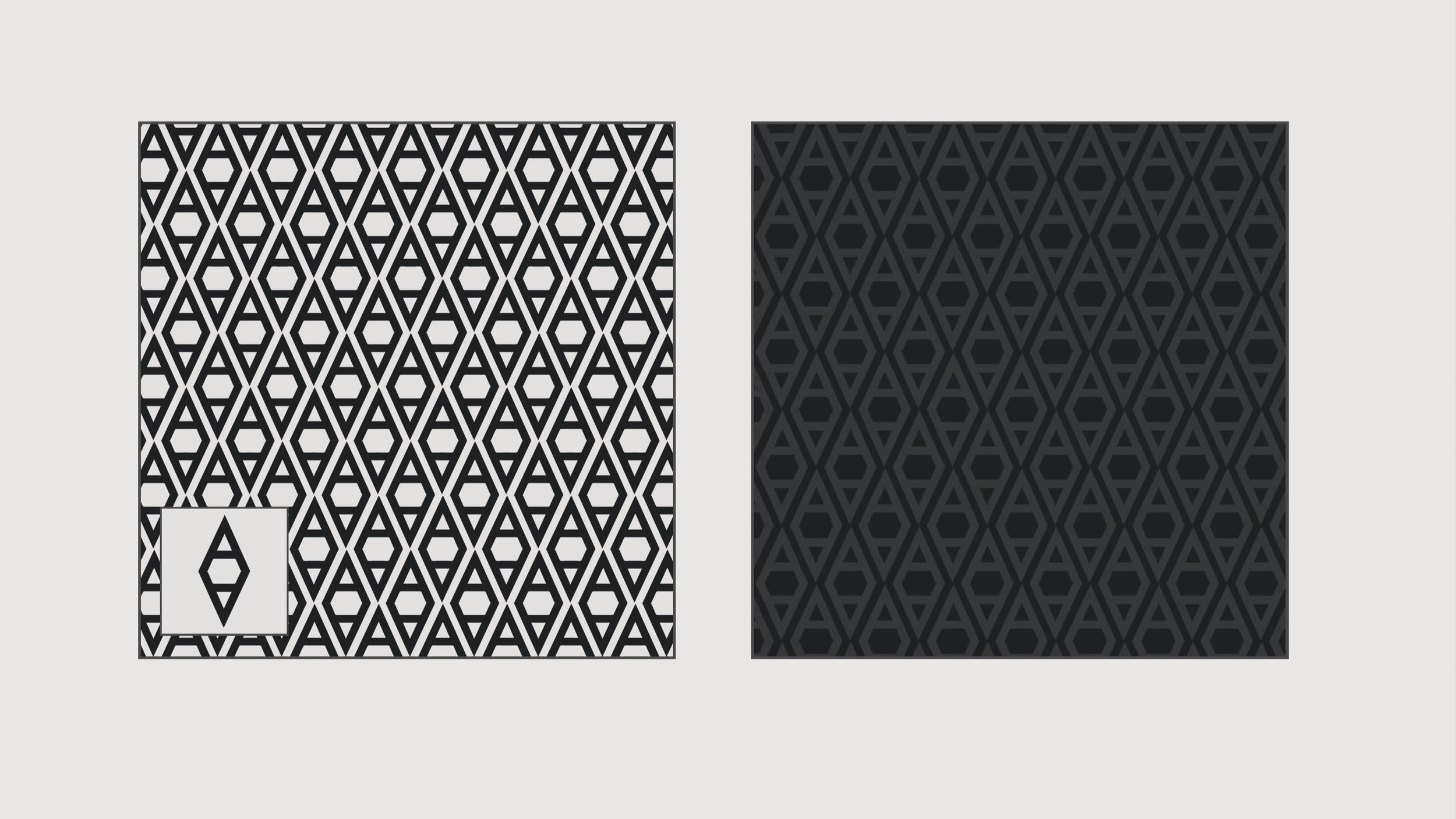
Athleta entrusted us with a goal to craft a monogram amplifying their iconic "A." Rooted in the founders' switch from "e" to "a" in "athlete," this emblem echoes Feminine Strength, woven with adaptability, empathy, and unity. The all-over design translates the rich history of the Athleta brand into a unified motif, marrying Athleta’s past, present, and future.

Through our meticulously developed product guide, we've equipped Athleta's design team to maintain brand standards effortlessly.
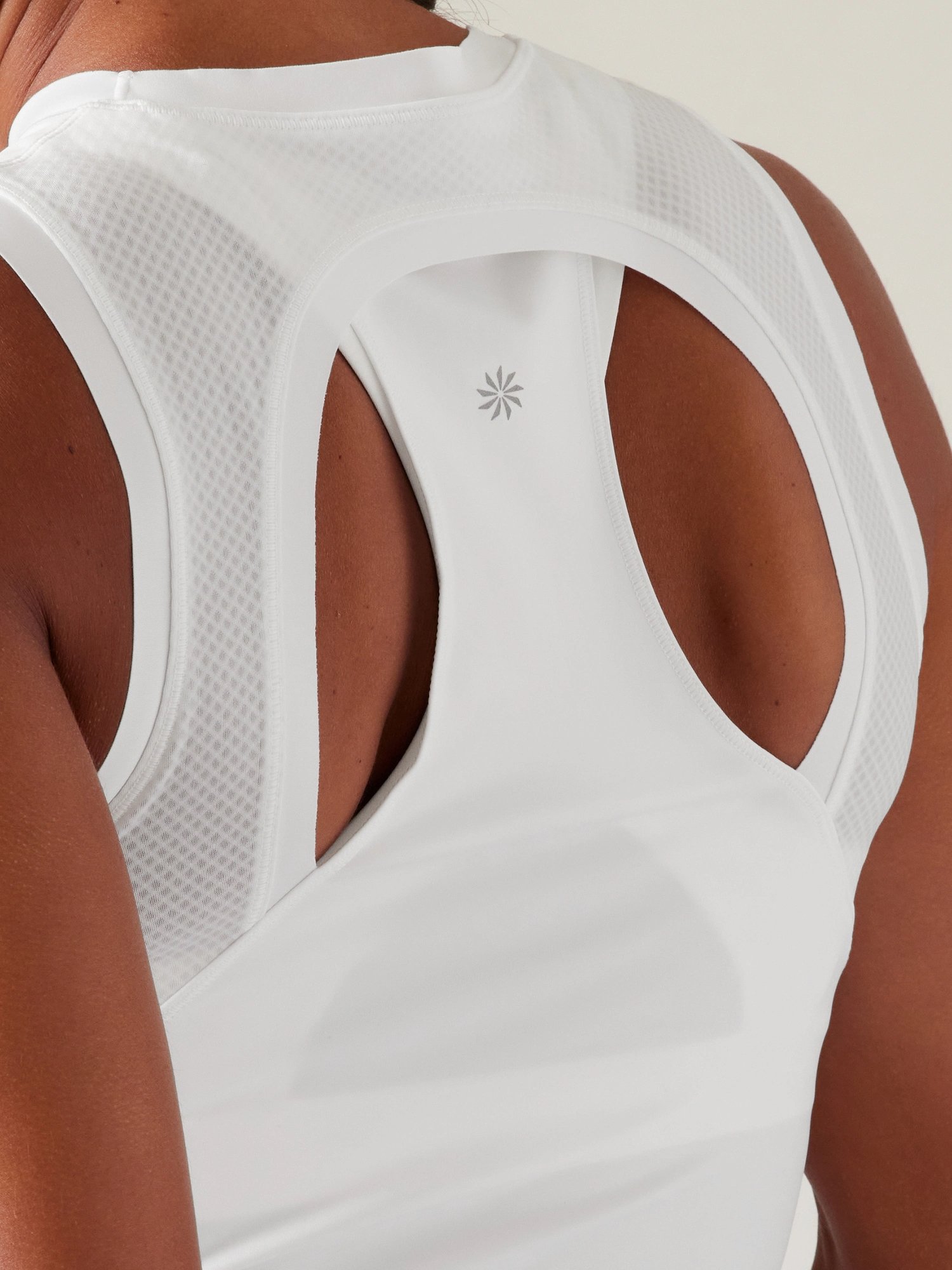
This guide details branding essentials like ATHLETA's wordmark and CHI logomark's placement, scale, technique, and color, curated meticulously for each franchise and fabric variant. By tending to these nuances, we're not just refining – we're safeguarding brand integrity.
This consistency across all expressions defines Athleta's distinct presence in a competitive market. We've strategically positioned logomarks on products, specifying every aspect from orientation to breathing space.
This guide acts as a golden compass, ensuring uniformity across various end uses and preventing the risk of diluting the brand's impact. It weaves the brand’s distinct "handwriting," creating a visual language that resonates.
Looking ahead, the product team is set-up and committed to continuous evaluation of the guide and branding system, equipped to apply their aligned approach with each new bullseye-branded product, learning from experience, enhancing Brand Power, and valuing customer input.
RECENT WORK


